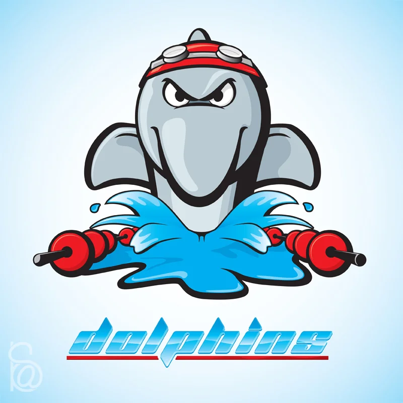
![The first part in what I hope will eventually be a four part series.]()
The first part in what I hope will eventually be a four part series.
![A logo concept for the Batman villain, Mr. Freeze. Based on a character description from Ron LaCour.]()
A logo concept for the Batman villain, Mr. Freeze. Based on a character description from Ron LaCour.
![Oddly enough, I don't actually care about Mega Man OR Pokemon. I just thought this sounded like a fun mash-up.]()
Oddly enough, I don't actually care about Mega Man OR Pokemon. I just thought this sounded like a fun mash-up.
![I think about logos a lot and during a week-long bought of insomnia I kept thinking of this image. I started some additional promotional materials too but since I don't have any intention to start a sherbet shop, I decided not to spend the tim]()
I think about logos a lot and during a week-long bought of insomnia I kept thinking of this image. I started some additional promotional materials too but since I don't have any intention to start a sherbet shop, I decided not to spend the time on it and moved on to new projects.
![This is a clear image of the design on the front of a flower box I made for my "Old Street" piece. ]()
This is a clear image of the design on the front of a flower box I made for my "Old Street" piece.
![I had originally intended on adding a blacksmith into this but the file got too unwieldy for my old computer to handle because I got caught up adding in a bunch of details that no one can see. By the time i got a new one I had already moved on. He's]()
I had originally intended on adding a blacksmith into this but the file got too unwieldy for my old computer to handle because I got caught up adding in a bunch of details that no one can see. By the time i got a new one I had already moved on. He's stuck at about the halfway point but maybe I'll get back to him someday.
![I was designing a stylized question mark to go with the typeface I was designing for logo project and it reminded me of the frame around a helmets face mask. I decided to make the helmet and after that I just kept adding on pieces. The technic]()
I was designing a stylized question mark to go with the typeface I was designing for logo project and it reminded me of the frame around a helmets face mask. I decided to make the helmet and after that I just kept adding on pieces. The technical schematic/star chart looking "wallpaper" was my favorite part to create.
![Like the Scoop logo, this image was stuck in my head for quite a while. There was really no choice but create the illustration. I suppose it probably means something but I'm not going to look into it.]()
Like the Scoop logo, this image was stuck in my head for quite a while. There was really no choice but create the illustration. I suppose it probably means something but I'm not going to look into it.
info
prev / next
1
2
3
4
5
6
7
8
9
10
11
12
13
14
15
16
17
18
·
·
·
·
·
·
·
·
·
·
·
·
·
·
·
·
·
·


